Doodle, Draw, & Design
Doodle, Draw, Design
Campers had fun while creating their own art by using line, shape and color, and even brush up on some new drawing techniques. Zentangles, Mandalas and Kaleidoscope art jump into the mix while campers learned the basics of composition and formal design. Add in the splash of color and the let their imaginations run wild. Skill set learned: Use line, shape color, Create pattern, Identify and create texture, Explore sense of depth and space, Learn descriptive art terms, Examine personal observation and question. Instructor: Linda Evans, National Design Workshop Art Educator.
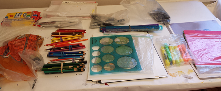
Instructor Linda Evans comes prepared with her own stash of tools for camp, mix in the Chaffee Art Center’s supplies, the campers had a multitude of options to use in their designs.
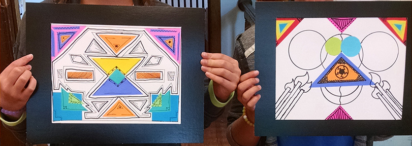
Campers learned various forms of composition including symmetry. Above highlights bilateral symmetry with the left and right sides being mirror images of each other. The campers used lines and cut paper shapes to create these unique designs.
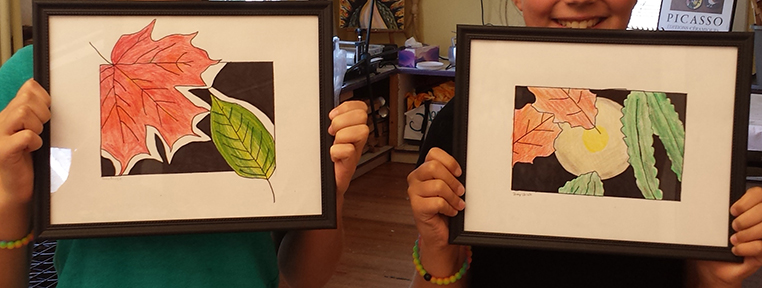
The opposite of symmetry is asymmetry where no mater where you draw an axis the picture is never the same. Campers were challenged to create balance in the absence of symmetry. Using leaf rubbings and layering colors to create shadow and light, these beautiful designs were ready for framing.
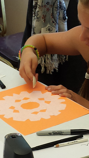
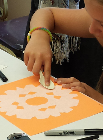
Mandalas are the perfect example of radial symmetry. After studying various styles of mandalas, campers created there own designs. Using coffee filters, they cut out the base of their mandalas and glued them to colorful paper as a background. Above you can see one of the campers smoothing out the wrinkles using a spoon and rubbing back and forth.

The campers then used their choices of pens, markers, crayons, colored pencils to create their designs. Here you can see the basic shape of the mandala displays radial symmetry but elements of bilateral symmetry can also be found in the design.
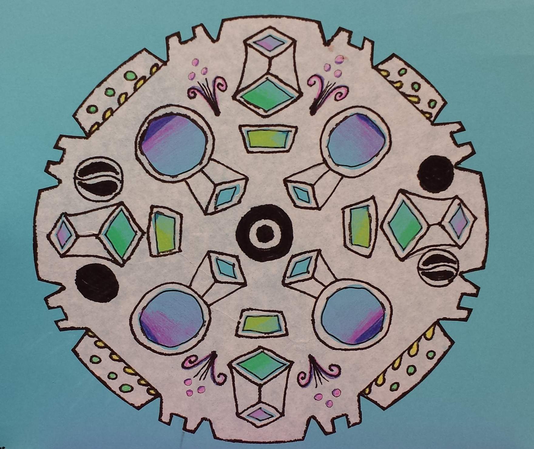
Here is a close up of one campers mandala that exemplifies radial symmetry.
Campers created zentangles to practice and learn elements of line and pattern design. Everyone got so into the project, that we forgot to take photos, but the lessons learned were showcased in elements of their final project, where they took what they learned and created their own designs.
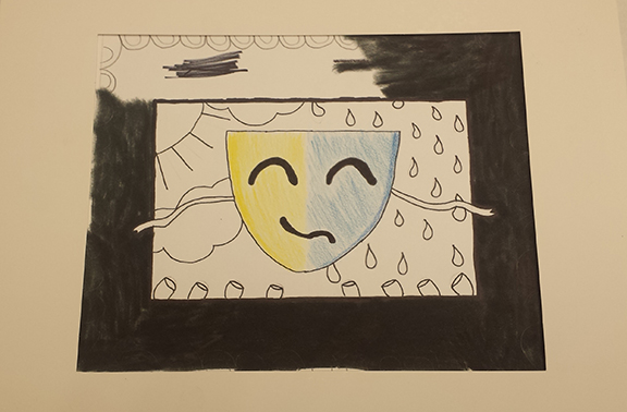
Here is a “Comedy and Tradegy” mask design in development. Some of the shapes showcase bilateral design while many of the elements also display a-symmetry.
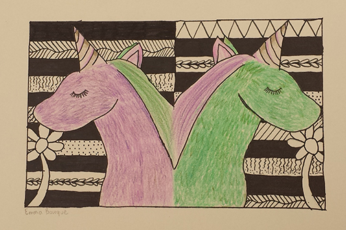
This final design shows both bilateral symmetry in the unicorns and the use of line and patterns learned from the zentangle project.
